Добрый день.
Теперь Codeforces станет удобнее просматривать с мобильных платформ. Для большинства из них теперь доступен мобильный вид, при котором меню уходит в левую выдвижную панель, а сайдбар — в правую. Обе панели доступны либо по специальным иконкам вверху страницы, либо по свайпу влево/вправо. Скрывать их можно либо тычком в основную область страницы, либо обратным свайпом. В мобильном виде основные шрифты чуток увеличены, что на большинстве экранов можно читать сайт уже без увеличения.
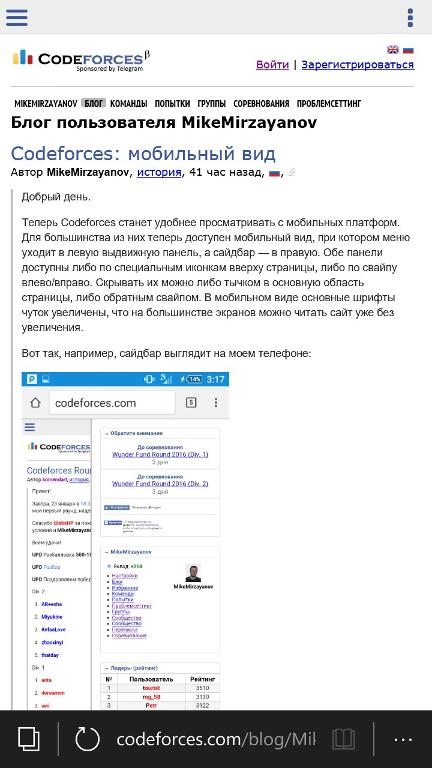
Вот так, например, сайдбар выглядит на моем телефоне:

Отказаться от мобильного вида (или, наоборот, включить его) можно внизу страницы в футере.
P.S. На старых браузерах, да и вообще на не-webkit могут быть сложности. Не уверен, что их легко исправить :-(


Bless, now potty time can be CS time as well
Nice :-)
Just two things,
First, It seems like it's not possible to use mobile version from devices with big screen (Like Laptop or tablet). It doesn't show the icons on top. (We can still swipe using tablet, but not in laptops)
Second, Now that website is mobile-compatible, Add an option so we can see submission details on standings using mobile (Like we do by double-clicking on problem score using pc)
Thanks again :)
I think, that in future we'll be able just to code and write contests on our mobile phones and tablets as well:)
If you have a 12-inch tablet with external keyboard and capable of running, for example, a C++ compiler, you can write code on it right now.
I'd also mention that although lots of input methods suitable for mobile devices were invented during the last two decades, this keyboard is produced since 1988 and still none of mobile input methods can compete with it in terms of convenience.
Thanks, but I still think that coding on your desktop is more comfortable and effective than on your mobile. It may be great if Codeforces will work on tablets as well as on PC.
That's great..But I still cannot view any full submited codes on my cellphone. How can i deal with it? Thanks!
I think you can click '#' link on the right of 'Accepted' to see submited codes.
I got it, thank you very much.
TIL, MikeMirzayanov has literally no rating at all.
And what are those "societies"? When I try to go to societies I get access denied. New feature Soon™?
Codeforces always does the best job!
Что такое "Сообщества" и "Сообщество"?
Для меня сейчас самые неудобные места с мобильного:
Я обожаю Codeforces, уважаю всех тех, кто работает над этим замечательным проектом. И так как я желаю, чтобы сайт стал только лучше, я хочу указать на некоторые недочеты, на которые, я надеюсь, обратит внимание команда Codeforces.
PS. Надеюсь, что разработчики обратят внимание на этот комментарий и что-нибудь предпримут :)
PPS. Только первый пункт относится к мобильной версии Codeforces, остальное относится к настольной версии.
У Вас Windows Phone 8.1? На Microsoft Lumia 550, Windows 10 Mobile, сайт выглядит нормально:
Тесты тоже выглядят как нужно:
И картинки в комментариях тоже вроде нормально отображаются.
Поправка: только первый пункт касался мобильной версии, тесты и картинки касаются только настольной версии сайта Codeforces.
FYI: It is not working on my iPad: http://imgur.com/a/el3mD
The first one is mobile site — I can't see the menu icon on left upper corner, neither the sidebar. (Also, swipe left/right may not be a good choice — that was used for going back / forward in some systems).
The second one is using 'Request desktop version' — the zooming has a big issue. I remember it was working properly few days before.
The only thing I want for mobile site is this: make it possible to click on the score on scoreboard to view submission list. (It is impossible to do it because double click was registered for zooming).
By the way, there is always an issue for me when I writing comments on PC: when I move my mouse over this button, the list will not show up correctly so I can't add links to a user / contest: http://imgur.com/Wq1UOWl
Thanks. What is iPad model?
I'll look into your requests.
Model: ML0R2LL/A (iPad Pro, resolution is 2732 x 2048)
You can reproduce it in Chrome: push F12, then toggle device mode (the 2nd icon on up left corner, looks like a phone), select iPad then change resolution to 2732 x 2048.
And sometimes it will not work properly on iPhone (MKV22LL/A, resolution is 1242 x 2208) like this (but sometimes it can work.. a bit random): http://imgur.com/a/CkO2S
Another suggestion is: when you opened one sidebar, you will close another automatically, otherwise you can open both sidebar and then for me it is impossible to close them unless reload the page. (See the 2nd picture in the link.)
I wish we could have a Codeforces that also works without JavaScript and Flash Player. I usually disable JavaScript, so then I'm not able to open some of links in Codeforces! (well, at least they look like http links!)
I don't have flash player installed on my favorite browser, it's so annoying to switch to another browser when I want to hack submissions. I agree that using flash helps keeping users from copying codes for hacks; but most of other missing functionalities are easy to implement for a browser that does not have JavaScript enabled...
I really like and appreciate everything about Codeforces but this fact that Codeforces won't work fine without JavaScript. It was on my mind for a long time, I though it's now a good place here to say it.
is there really a good reason to disable JS?
So why there exists an option in many browsers to disable JavaScript then? Yes there are good reasons if you are using an old computer or if you have an expensive or slow network connection. There are many other reasons, like less advertisements, etc.
I hope I'm not being rude. I'm seeing progress in CF every month, that is great. I am not complaining at all. I just wanted to request a feature :D
Js is literally execution of code on your machine. Code which comes from the internet and may be not 100% trusted. Also JS is very good tool for browser fingerprinting — you can visit the site, came back in a weeks, with cleaned caches, cookies or whatsoever and it will still be able to identify you. (For more information please see panopticlick.eff.org)
So disabling JS by default is extremely good security measure.
But i am more concerned with flash: it is binary distributed, with unknown source, highly vulnerable shit, which even adobe doesn't recommend to use now (yay, they've made an announcement about it few time ago).
I can live with JS [on trusted websites], but i will be extremely grateful if it will be possible to hack solutions without flash, because my machines are flash-less and i can't participate in hacking. Though before some redesigns in CF (before test round 12) it was possible to use shumway instead of flash, and it worked.
Definitely a good start, but has problems. The indentation of comments of levels 2 and deeper (replies to replies) is smaller than the comment that it reacts to. In general, the small indentation makes reading comment chains confusing — it is hard to tell the level of the comment quickly (does it reply to the previous comment or is it simply under it?) Not sure what that is caused by exactly, perhaps the padding is too large for mobile — compare it to reddit's mobile version, which I think is solid. Also, tables (that cannot be split like normal text) make the page too wide: for example here. I'm on a Nexus 4 by the way.
This might have sounded very critical, but I appreciate this is even being worked on at all. Keep it up! :)
Thanks a lot Mike for mobile version, again thanks for the desktop version switch. :( Coz I was facing problem in my tablet.
Dunno if anybody posted this. We view others solutions in contests by double clicking the box in standings page How to do that in mobile ?
Сделайте чтобы можно было кликать по решению из таблицы результатов. На Desktop это двойной клик.
Можно ли сохранять предпочтение версии сайта вместе с сессией? А то я каждый день захожу на CF со своего планшета и каждый раз переключаю на десктопную версию, раздражает сильно.
+100, раздражает неописуемо.
As I can search on the blog, I do not find that functionality on mobile view.